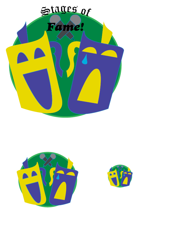
Of the principles of design, this logo for a hypothetical theater company relies heavily on color contrast. You could also say that proximity was very important in deciding where the text should be as well as where each mask should be placed. I also used repetition. When I created the first mask, I simply copied it, flipped it, then colored it differently.