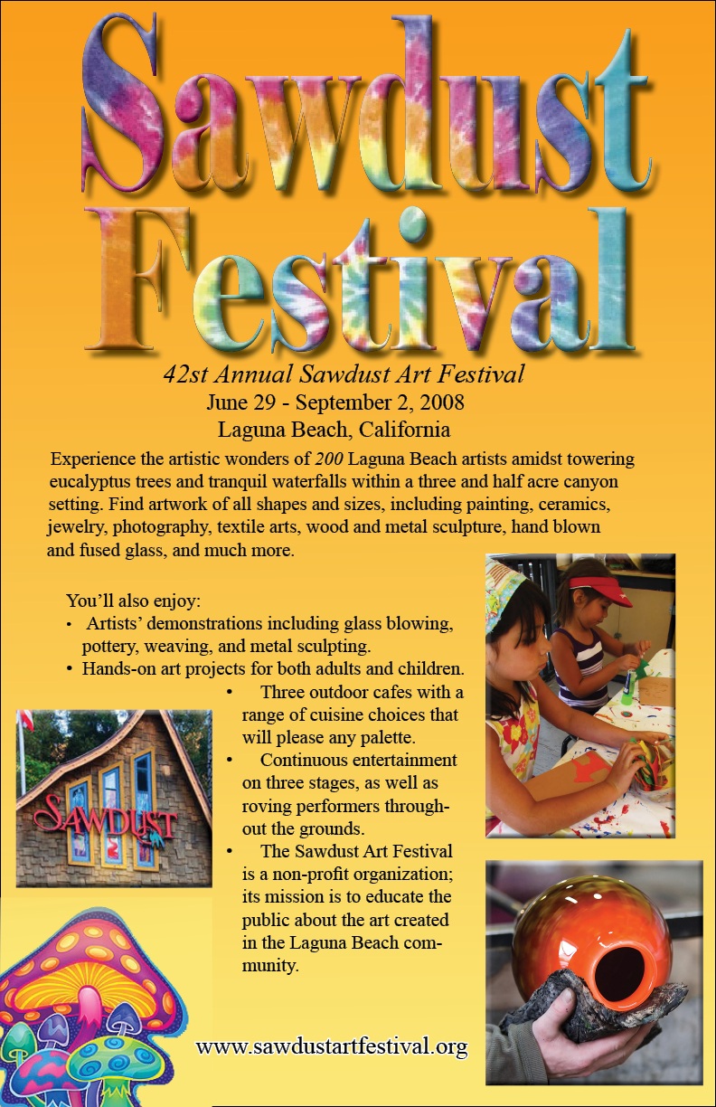
This festival poster uses a contrast technique. The tie-dye themed font against an orange-to-yellow gradient makes the words pop, especially where the letters are pink and purple. Alignment was also important in centering the text at the top of the page, as well as the web address at the bottom.
